


 120 / 231

Brasil
PackTrends
2020
120
aesthetics and identity
employed to stimulate the association of the brand to the
product (natural or environmental appeal), awakening
feelings and expressing its personality, captivating and
influencing the consumer in the purchase decision.
Two major trends are seen in the use of colors
and images in graphic design packaging. One is the
unlimited use of strong and striking patterns, to attract
consumer attention and / or forward the premium
appeal of a given product category. Another trend is
the use of a limited number of colors for the product
category associated with the aspect of healthiness or
with sustainability appeal.
The use of striking colors, carefully selected to
create distinct brand identity, was completed onpremium
product packages from the Archer Farms portfolios in
the United States, which also made use of the option
to keep a die-cut window to reveal the product (HILL,
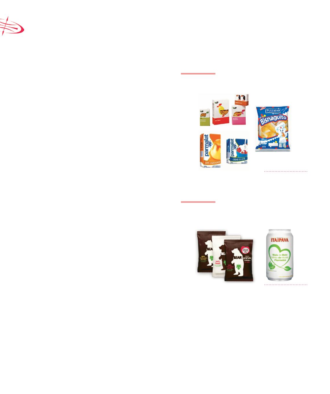
2010) (Figure 5.18). In Brazil, the Pullman brand
introduced a new package for its product, Bisnaguito,
who gained a vibrant color and was highlighted as the
brand’s mascot, seeking a closer relationship with the
consumer, combining modernity with tradition and
offering more visibility in retail outlets (Figure 5.18).
The packaging portfolios for sweated condensed milk
and cream, Parmalat brand, has also been revamped
with new colors and a design to highlight the products
in retail outlets and attract the attention of consumers
(EXAME.Com, 2012) (Figure 5.18).
The trend of limited colors was used on
packages of English snacks brand Bear to convey an
aspect of being 100% natural, free from added sugar,
preservatives or additives in products. With matte finish
and limited colors to indicate the simple and natural
aspect of the product, the packaging reflects the brand’s
personality (HILL, 2010) (Figure 5.19). Moreover, the
use of limited colors is a feature favorable to products
with a sustainable appeal, as the reduction or absence
of pigments in packaging facilitates the material
separation and recycling process. It was demonstrated
by the beer brand Itaipava with the AMA Project logo
design (Environment Mobilization Area Project), which
aims to preserve the environment (EXAME.Com, 2012)
(Figure 5.19).
FIGURE 5.18
Packages with striking colors to
create distinct brand identity
Source: Press Release
FIGURE 5.19
Limited colors to represent the
healthiness or environmental
appeal of the product
Source: Press Release
Marketing techniques indicate color separation
into three groups: warm (red, orange and yellow), cool
(green, blue and purple) and neutral (monochromatic
colors like black, gray and brown) which are usually
associated certain values and feelings to attract
consumer attention. The green color, for example, has a
strong bond with the balance and nature and, therefore,
is commonly used in products that are natural, healthy
or with some ecological appeal. The natural brown
paper or paperboard is also used in some cases for