


 121 / 231

Brasil
PackTrends
2020
121
aesthetics and identity
that purpose. The blue color arouses feelings of loyalty,
trust and friendship, and red represents dynamism,
is stimulating, passionate and exciting and can be
used to highlight specific points to attract attention
(MARCONDES, 2011; HILL, 2010).
The color can even be given through the addition
of pigments to the packaging material itself. This
technique is constantly observed in the market of glass
containers, with the development of special colors,
either to confer light protection to sensitive product,
to promote the image or highlight the key attributes of
the product . As an example, the blue color of the glass
bottle for water from Elisabethen Quelle, in Germany,
was used mainly to highlight their purity and freshness
attributes (Figure 5.20). In order to strengthen output
growth in the Brazilian market, the extra virgen olive
oil, Gallo brand, has invested in a darker glass bottle
to better preserve its quality against direct exposure to
light (Figure 5.20).
FIGURE 5.20
The use of color in glass to
highlight the
premium
quality
of the product
Source: Press Release
In the Brazilian market, an example of this trend
for plastic packages is that of PET bottles for water,
Ouro Fino brand, who bet “on being different” and
broke sharply from standard colors usually used in
packages for mineral water (clear, blue or light green) to
highlight and open new markets (MARCONDES, 2011).
In this case, the company also bet on the differential by
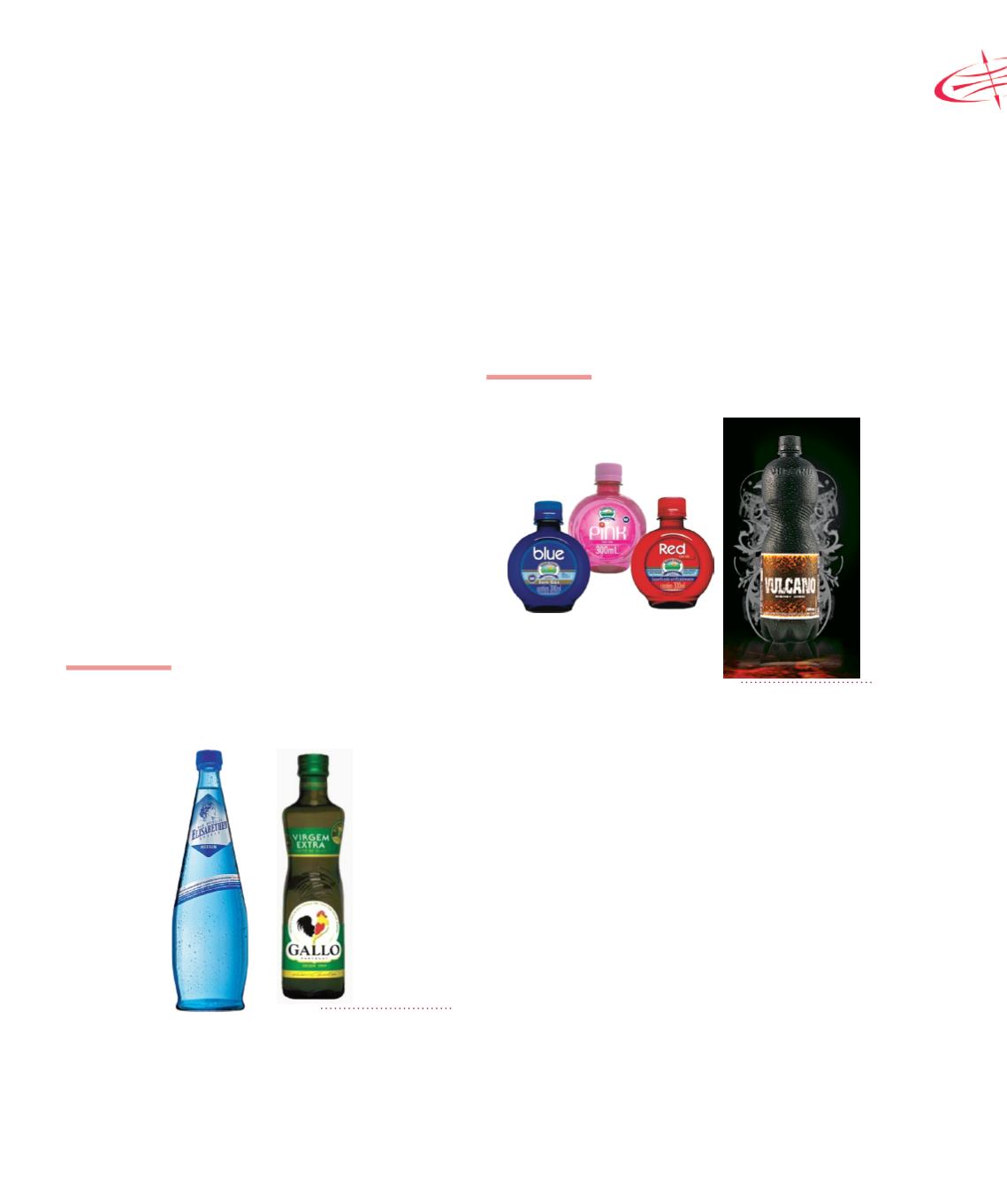
the shape of the package. Another example is the black
PET bottles for energy drinks (Figure 5.21).
FIGURE 5.21
Colored PET packaging for drinks
Source: Press Release
Illustration is another option used to indicate the
nature and quality of a product. With more sophisticated
illustrative shapes the personality of the brand can be
conveyed, highlighting itself at the points of sale and
increase the product appeal. Below are some products
that have adopted a strong illustrative style, with the
aim of demonstrating the brand identity. An example is
the brand of handmade cookies, Two by Two in the UK,
which aimed at increasing public interest from children,
using illustrations of animals from traditional tales and
fables, and each picture of the animal represents the
shape of animal cracker sold (Figure 5.22). What On
Earth is another UK brand that introduced a simple and
beautiful concept package for organic food. The package
was produced in gray tones on a plain background to
represent the organic nature of the food; the package
also has a label colored to indicate different types of
products (Figure 5.22).