


 124 / 231

Brasil
PackTrends
2020
124
aesthetics and identity
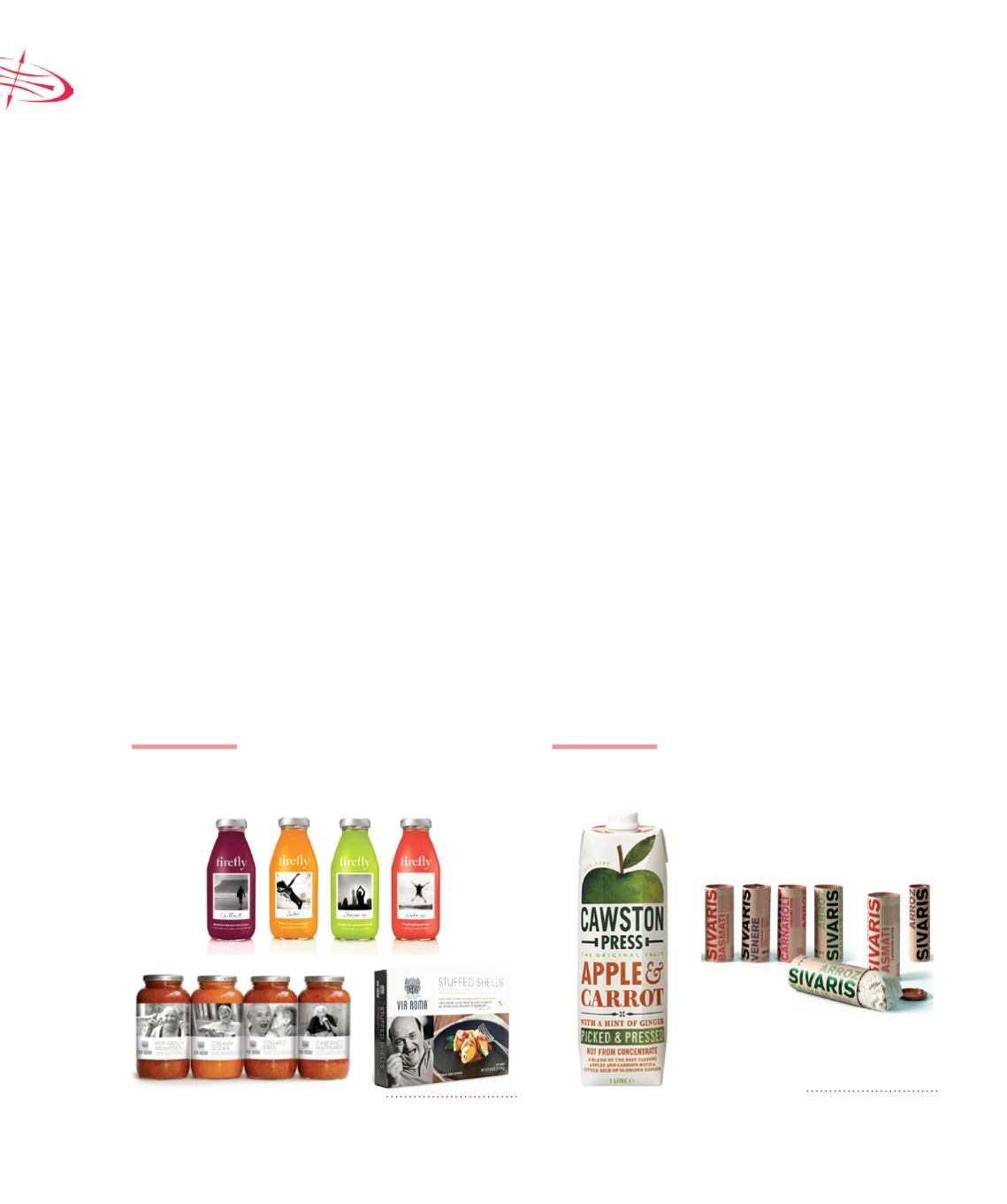
Another graphic design option is the use of
photographs, whose focus is to show, in a sumptuous
manner, the product quality to stimulate consumer
desire. Other approaches may be directed to indicate
the authenticity and origin of the product and still
present ways to direct them to a specific people group
(HILL, 2010). This concept is still not widely used
in Brazil, but one of the examples presented are the
packages for the energy drink Firefly manufactured in
England which, instead of showing the product flavor on
the label by fruits (strawberry, orange etc.), it displays
photographs of observations about the state of mind of
those seeking for this beverage (Figure 5.27).
Another example is the food brand Via Roma,
which made Tuscany and its inhabitants the focus
of their packages, marking the Italian origin and
authenticity of its products (Figure 5.27). The various
photographs used create an authentic Italian image,
with strong personality and expression of emotion to
ensure the highlight at point of sale and consumer
loyalty (HILL, 2010; EXAME.COM, 2012).
Typography is another feature of graphic design
used to create a distinctive image on the packaging, via
a text graphically treated, and thus highlight the brand
identity. The decision on using typographic features
is directed to the desired form of communication, ie,
it should represent the values of the brand so that
it is perceived by consumers with readability and be
distinguished on the shelves. One example presented
is the packaging for juice brand Cawston Vale, from the
UK, which relaunched its product portfolio with a new
name, Cawston Press, with a new brand identity, aiming
to draw attention to the premium quality of its products
and to revitalize the sector (Figure 5.28). Sivaris is
another product category, a rice produced in Spain,
who revitalized and created a new visual identity by
the typography and color in packaging tubes and seals
common to the market (HILL, 2010) (Figure 5.28).
Therefore, the brand identity can be created
through a variety of graphic design techniques and thus
ensure the positioning of the product by means of a
unique appearance.
FIGURE 5.27
Products that use photographs in
graphic design
Source: Press Release
FIGURE 5.28
Packages that renew their identity
with the use of typography
Source: Press Release